The term UX design is most commonly used in the context of web and app design, and thus, may not be what comes to mind in relation to the very analog concept of board games. However, I believe that, in many regards, the exact same principles apply to both fields.
UX stands for User eXperience and it is, in short, the experience a user has when interacting with a product. With that, it can be interpreted that UX design is the design of the product that affect that experience. On web pages and in apps the interaction behind the experience is easily recognized as the user navigating via scrolls and clicks etc., and the UX design as the design of the interface that lets the user do this. In board games, however, the interaction is not as tangible, but it doesn’t mean it’s not there.
I would define user interaction in board games, in relation to UX design, as “Every time a player is looking at or using any part of the board game in an attempt to achieve something or extract some information from it”. This could be when a player is moving a player piece on a board, or looking at a card in their hand to understand what it will do when it is played. It could also be when a player is placing a tile and need to figure out the placement restrictions or what will happen when the tile is placed.
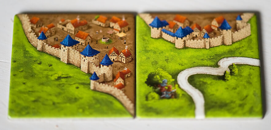
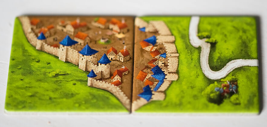
For example, the placement restrictions of the tiles in Carcassonne are easy to remember (and might even be intuitive to learn) thanks to the UX design of the tiles. The placement in the first image intuitively looks wrong, because it does not fit together, while the placement in the second image looks right. However, the tiles are not as good at conveying how the placement of meeples work.
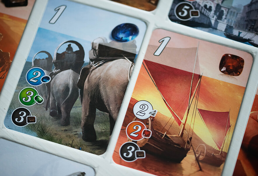
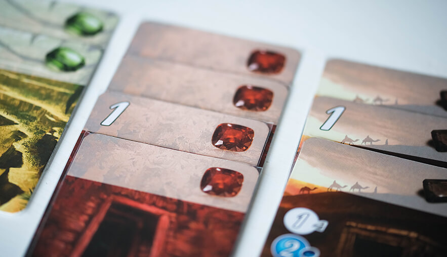
Some components might need to have a UX design that works for several different interactions. The cards in Splendor, for example, are interacted with both when players are looking to buy them, and when they already have them in their tableau. When players are looking to buy the cards (first image) they need to be able to understand what the cost is, as well as what they will gain from buying them. However, when the cards are already in a players tableau (second image), only the latter information is necessary. The UX design therefore lets the players preserve space by having all the important information placed clearly at the top of the card.
Both mentioned examples show UX design that does its job, and chances are you have not even reflected over the design choices made, just because they do work. However, if you come across bad UX design, you are bound to notice that something is wrong.