
The saying “A picture is worth a thousand words” refers to a picture often being more effective at conveying a complex idea than words are. This is as true within board games as in other fields, and applicable both in rulebooks and on components. But what do I mean by that? Let’s dive in.
One of the most cumbersome things about picking up a new board game is that you have to learn the rules. Also, if no one is there to teach you, you will need to learn exclusively from the rulebook (or in some cases from a video, but should that really be necessary?). As long as it is not a super light game, the rules for board games are often quite complex, and as we know: pictures are generally better at conveying complex ideas than words are. The conclusion seems quite obvious: pictures should be used to help players understand the rules. This includes everything from simple pictures showing how a component looks, to complex pictures showing the flow of one or several actions in the game.
Exactly how the pictures should be used does not have a universal answer. Instead, it depends entirely on the game. However, there are a couple of categories that should be considered when adding pictures to your rulebook.
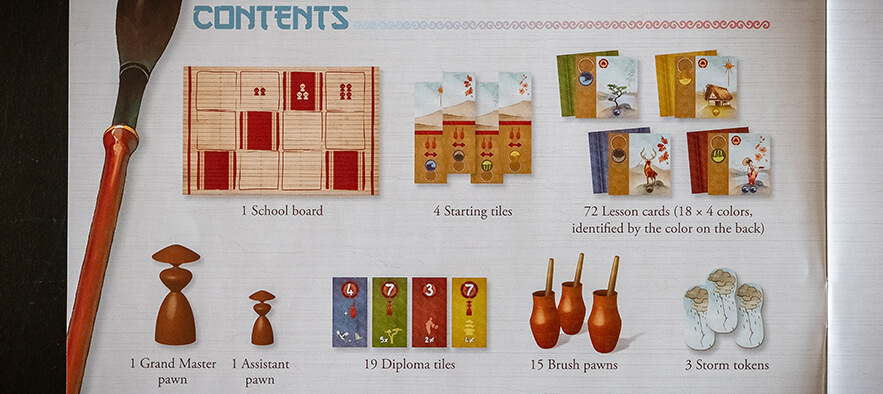
Some component lists are only just that, lists of the names of the components along with the amounts. However, that’s not entirely helpful when a new player is trying to familiarize themselves with the components, or check that all the components that should be in their newly purchased game are. To help with this, I believe there should always be clear pictures of all components adjacent to their respective list item.
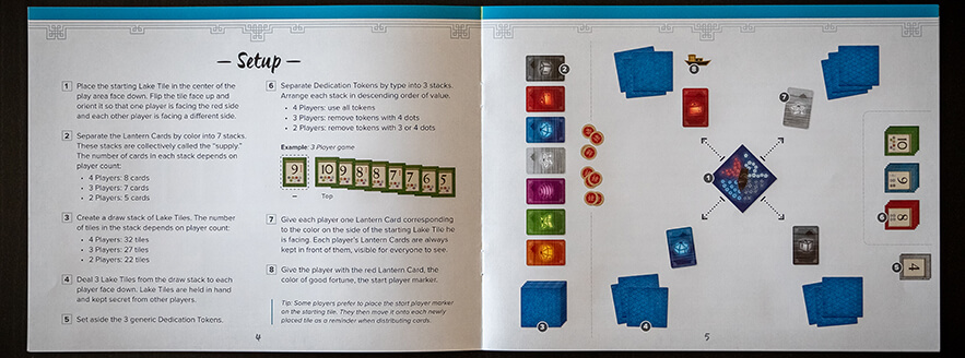
I believe setup pictures in part have a similar purpose to those in component lists: making sure players know which components are referred to in the setup instructions. The other purpose is, of course, to make sure the setup instructions aren’t misunderstood, and a good setup picture could mean players don’t even have to read the instructions. One thing I should be part of every setup instruction is references to the setup picture; they can be used both to check what the instructions are talking about, and to quickly find a delta in the instructions by looking for the component in question in the picture.
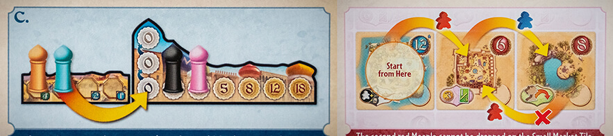
Example pictures are definitely the most varying across rulebooks, because they depend so much on how the game is played. That’s both in terms of how the pictures should look and what actually needs example pictures. However, the more complicated the rule, the more important the example picture becomes. Drawing a card probably won’t need an example picture unless there’s something really weird going on, but a sequence of actions locking together to create a specific result may even need several.
On components it’s less about intricate pictures that teach you the rules and more about reducing the overall need for text both to reduce any language barrier and to make the information easier to digest at a glance. Pictures on components speed up the game because pictures are quicker to take in and make it easier to recognize patterns.
Mostly when I talk about pictures on components from a graphic design perspective, I talk about icons. However, there are also frames and other graphic elements that help players understand the use of different components.
Icons are perfect for representing a single concept, like a type of resource, cost or even an action. They don’t even have to be clear enough on their own that players instinctively know what they’re supposed to represent. All you need is for them to be distinct, and to teach them in the rulebook; preferably including an icon reference. That said, the closer connected their looks are to their meaning, the easier learning them will be.
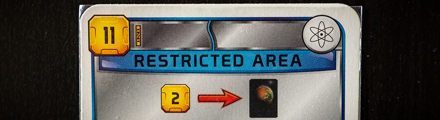
Cards, which may otherwise be quite wordy, especially benefit from using simple icons instead of a lot of text to explain what they do. To describe the action below in text would both take up more space on the card and be much less recognizable at a glance. If badly written, it might even open it up for wrong interpretations.
However, when using icons on cards or other components, it is as important that they are not ambiguous as it is for written text. Consistency is of uttermost importance. If you start using the same or even a too similar icon to describe two different things, it’s really hard for players to know which one is referred to in a specific instance, especially if there are no contextual clues to the difference (like what kind of component is’t being used on, or the placement on a card). On the other hand, if you use two different icons to try to communicate the same thing, that will prevent players from immediately making the connection and seeing the pattern.
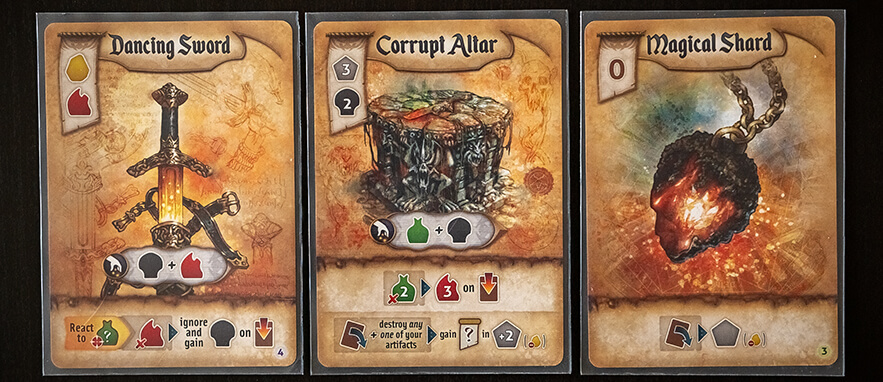
A single component often needs to communicate several things that may not be entirely connected to each other. To do this effectively, there needs to be a distinction for which part of the component is trying to communicate what. Layout can be one part of this; placing the cost of the card in a specific place on all cards, while putting their effects in another. Another part is using graphic elements with different looks to differentiate between different types of information.
The cards below convey 3 main types of information at the same time: cost, collect ability and powers. The different types are separated using layout (with the cost always being placed in the top left corner, for example), but they are further separated using different types of graphic frames: the cost has a hanging banner, the collect ability has a bubbly metal frame and the powers have parchment paper. When a card has more than one power, every other one also has a slightly brighter background to separate the different powers.
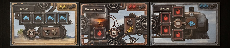
These following cards, however, don’t really use a consistent layout, making the use of frames and graphic elements to separate things that much more important. There are spaces where dice are supposed to be placed that have thick metal frames and a dark background (as well as an icon in the middle, but that’s not what we’re talking about here). Each card also has an effect as well as a threshold number. These are connected through their background and by the threshold element pointing at the effect while they are separated by their shapes and frames. The threshold has a round shape and thin frame while the effect has a rectangular shape with a thicker frame, but a slimmer one than the die slots.
Pictures have several important uses in board games, but you always have to consider what your game’s needs are when deciding how and when to use them.