In the name of continuing the blogification of our posts from our Instagram page, let’s explore the world, and graphic design, of Above and Below.
Above and Below is an exploration/building/worker management game with a heavy storytelling aspect. Like all Ryan Laukat games, it has really beautiful art. ...
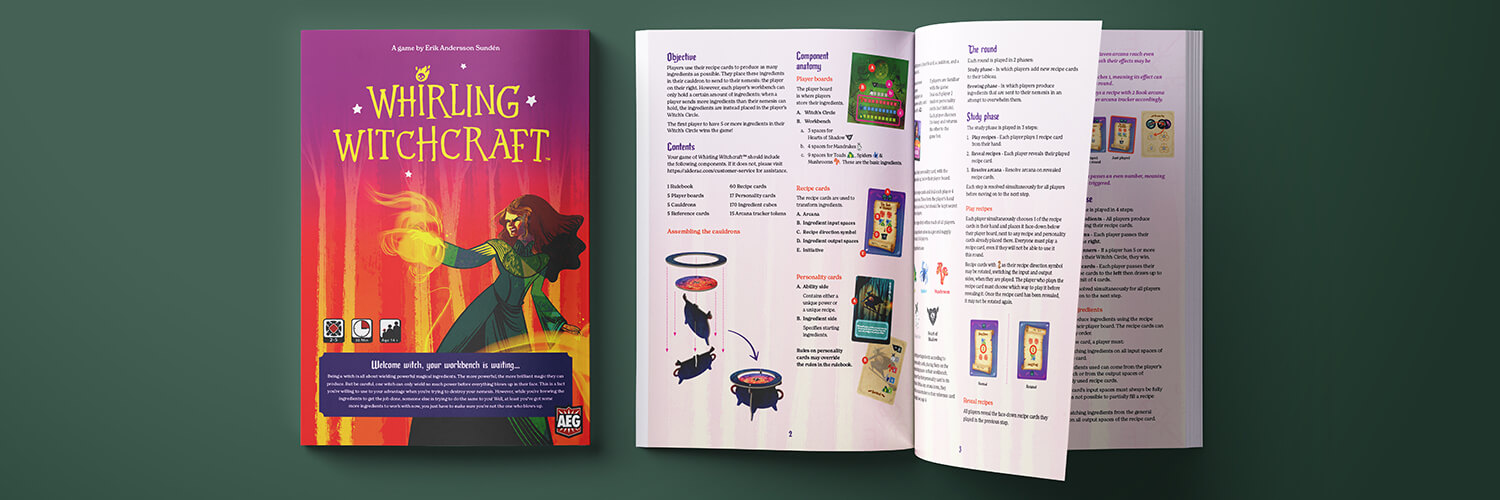
Having a clear and easily understandable rulebook is extremely important; it’s the first impression many players get of your game and you don’t want that impression to be soured by frustration. If the rulebook is ambiguous some players may not even learn the game correctly, further souring the experience of your game. Therefore, it’s important to have a professional rulebook writer edit your rulebook text when you’re publishing a game. However, it is also important to have a clear rulebook when you, as a game designer, are playtesting your game. Otherwise players might play your game wrong, and provide feedback that in the best cases is not useful and in the worst cases leads you astray. ...
In the name of continuing the blogification of our posts from our Instagram page, let’s spread our wings and get into the graphic design of Wingspan. ...
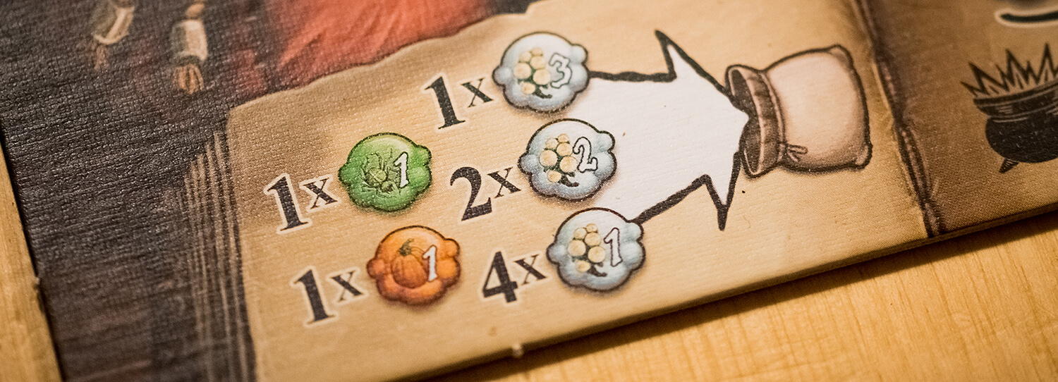
The saying “A picture is worth a thousand words” refers to a picture often being more effective at conveying a complex idea than words are. This is as true within board games as in other fields, and applicable both in rulebooks and on components. ...
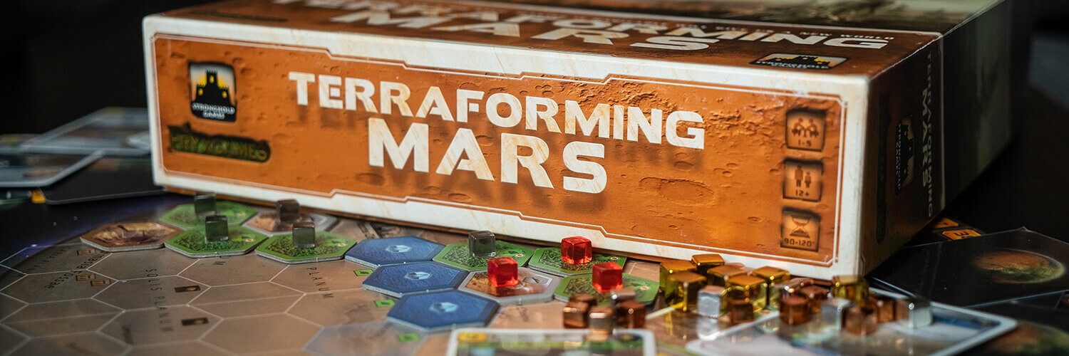
Maybe you’re already aware that we have an Instagram page where we make deep dives into the graphic design of already published board games, or maybe this is news to you. Either way, we decided that the learning opportunity you get from looking at the graphic design of other games should not be confined to the Instagram crowd. Therefore, we’ve decided to compile all the posts for one game into a single blog post, creating an all you can read graphic design bonanza. First up is Terraforming Mars. ...
A lot of people in the board gaming industry seem to be confused about the difference between graphic design and illustrations. Because of this, I want to clarify the terms, and explain why both are necessary for a great game. In short, illustrations are there to make the game pretty and the graphic design is there to make the game understandable. ...
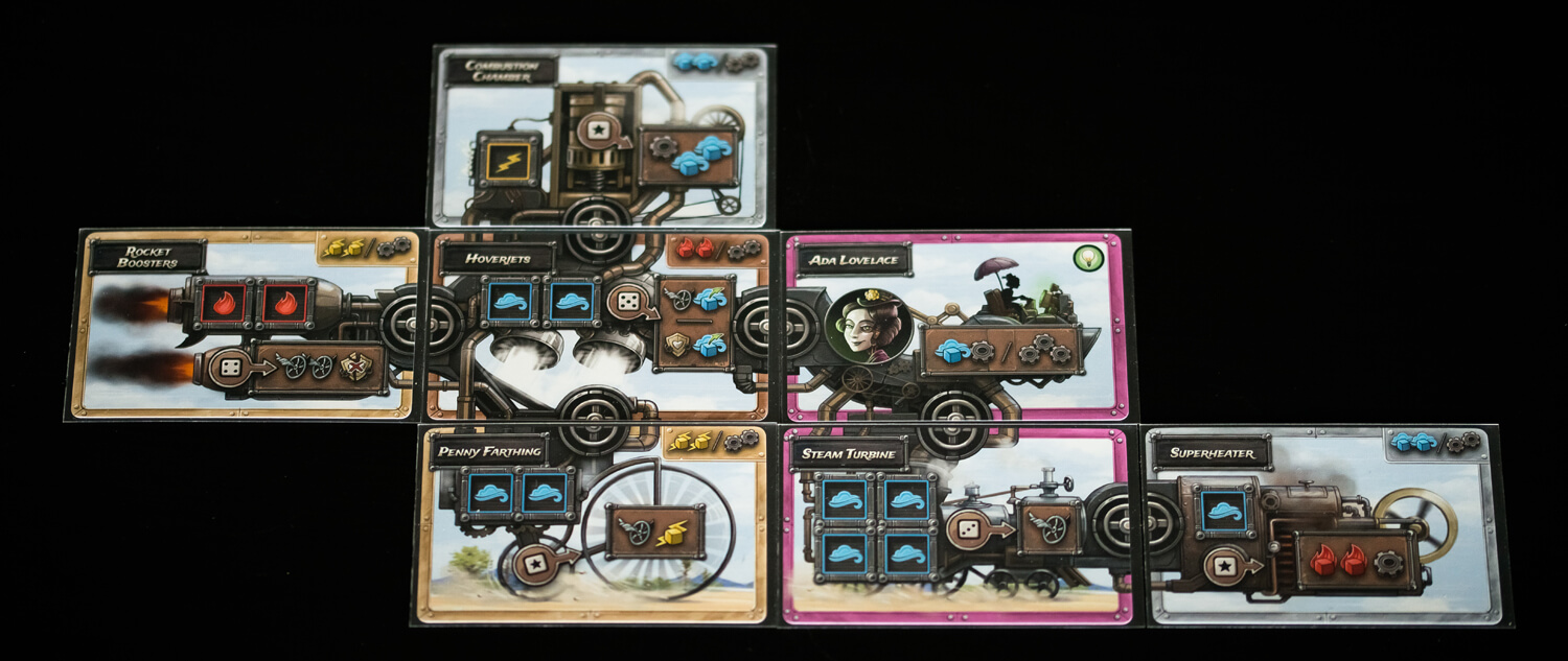
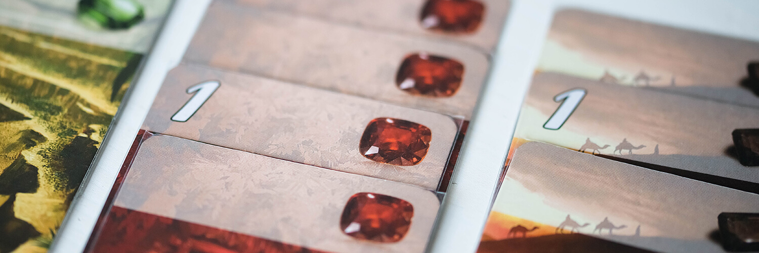
We need to talk about card design. You might think that designing a card is just slapping all the necessary information on the card in some arbitrary way, but that’s almost as far from the truth as you can come. You have to customize the card design to how the game is being played, and how the cards are being used. ...
The term UX design is most commonly used in the context of web and app design, and thus, may not be what comes to mind in relation to the very analog concept of board games. However, I believe that, in many regards, the exact same principles apply to both fields. ...