The Emerald Flame is a puzzle adventure revolving around finding the recipe for a transformative elixir. It’s currently on Kickstarter.
When we created the graphics for their Kickstarter page we chose to give them the same aesthetics as the box front in order to give the whole page that same feeling.
We made the title banners using the same font as the one on the box, a subtle stained glass window effect in the same colors as on the box, and a frame and text with a golden metal look. Because of this they are very closely linked to the box without being too distracting from the important part of the Kickstarter: the information.

To give the same variety to the Kickstarter page as the box has we made the title banners in two variants: one lighter and more green and one darker and more blue.


Some title banners were made more special with intricate knot designs.


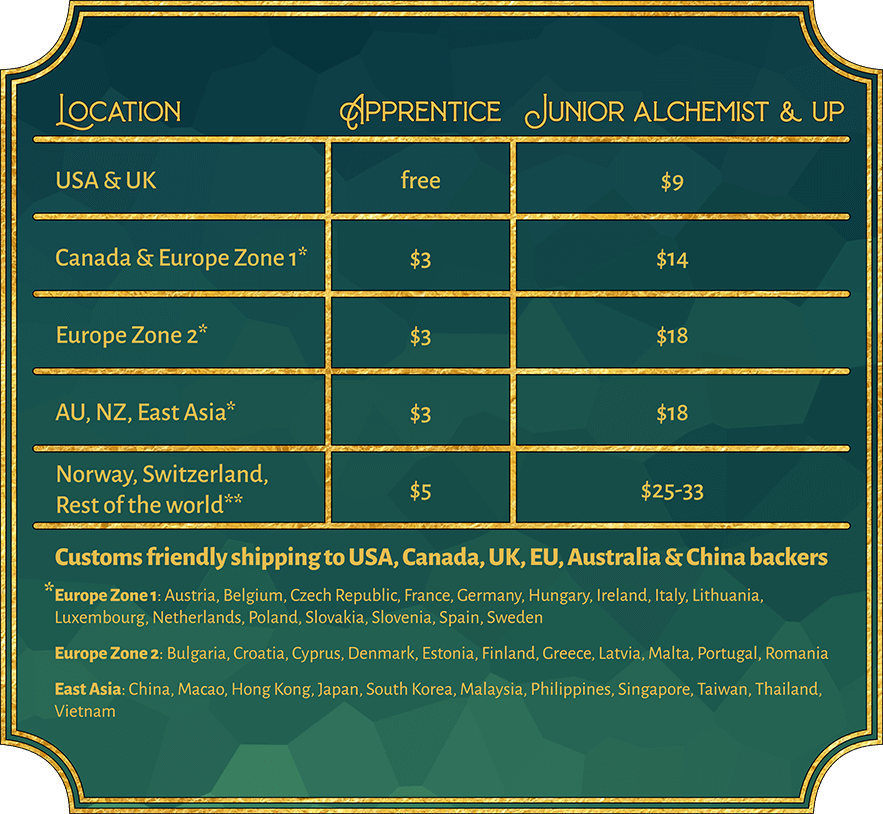
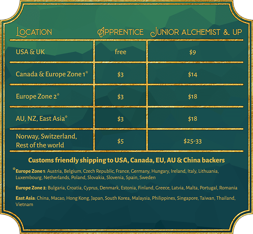
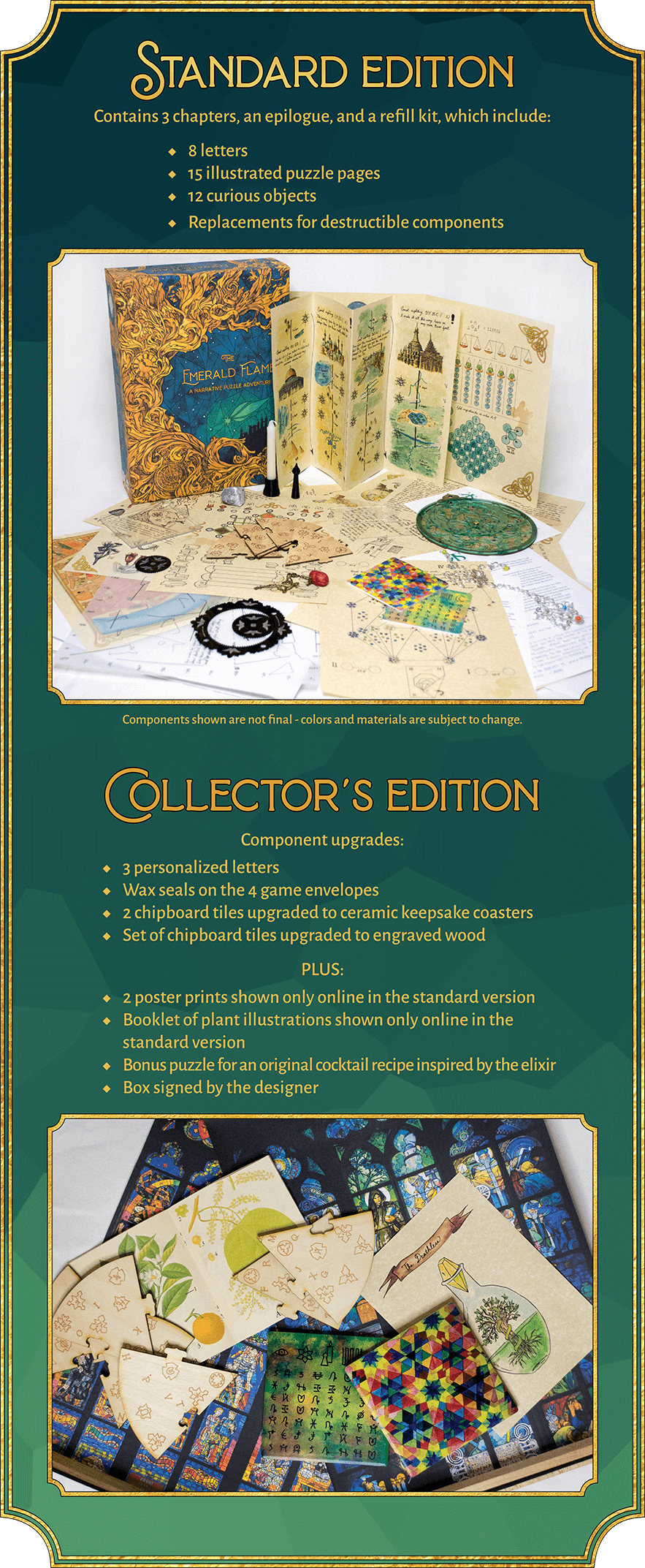
The infoboxes follow the design of the title banners closely; the biggest difference being the simpler frames that let the contents of the infoboxes speak for themselves.
Another difference from the title banners is that the infoboxes are tall enough to incorporate a gradual transition from light to dark. To make sure the infoboxes matched the title banners we delivered two of each infobox: one light to dark and one dark to light. That way the client could choose which to use for each section on the Kickstarter page.


The infobox for what’s included had to be made a bit differently from how they’re normally made; we didn’t want to show all the components and spoil the puzzle for everyone. Instead we used a photo of all of them together.

We also made sure that it was easy for the client to make necessary changes to the infoboxes.